

在 MetaTrader 4 中设置图表
Video Transcription: How to Set up a Chart in Metatrader
Hello there, this is Topratedforexbrokers.com here, and we continue our trading academy with a new concept regarding the charts and the MetaTrader. You know what the MetaTrader is? It’s the most popular trading platform when it comes to retail trading. And today we will discuss the particulars of a chart of a currency pair.
(0.25) First of all, you must pick a currency from this MarketWatch here. And it doesn’t matter what that currency is, as the steps that we will discuss here will be valid for both the Metatrader 4 and Metatrader 5.
(0.43) So, for example, let’s choose USD / Japanese Yen. We can either click and drag a currency pair on an actual chart that is already in front of us, like this, and then you will have the USD/Japanese Yen on the screen, or, right-click, and we go for chart window and a new chart window here will open with the desired currency.
(1.11) If we want to have more space for analysis, we can close the market watch from here. You can easily open it and close it just by selecting it, and now the chart is showing across the screen. Let’s repeat the steps that we discussed in the previous video. Right click properties and go to the ‘colours’ and go either “bar up” where a bullish move is usually associated with the colour green, but you can actually set up the colours however you like.
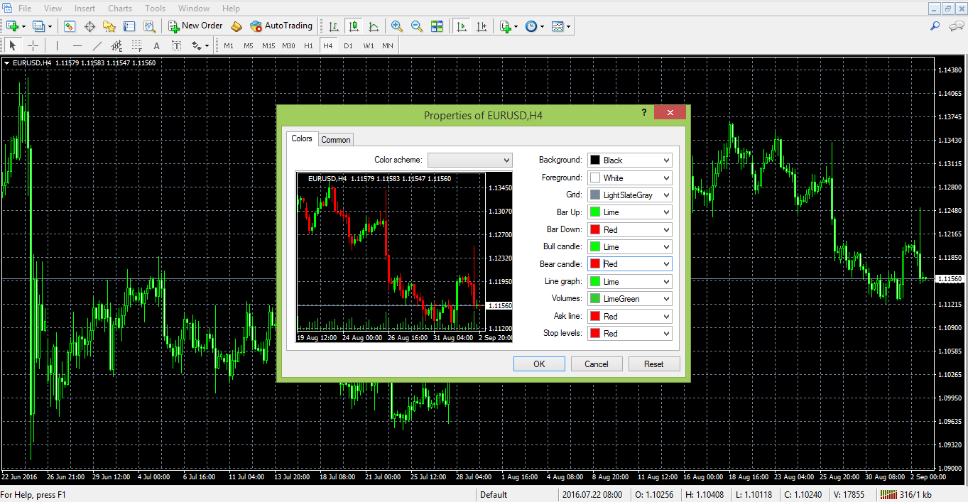
(1.49) ”Bar down” or a bearish move is shown in red, so a bull candle should be green, bearish candles should be red. You can choose any kind of background that you want. Let’s choose white and go with a black foreground so that we can see the data and the levels of the currency pair. And then we go onto the current, and you have three options for a chart.
(2.21) By default you will have a bar chart, what does this mean? Let’s zoom in. These are not candles; these are bars. This is an old classic technical analysis as it appeared for the first time in the western part of the world. Technical analysis was invented when people looked for pairs to interpret future price movements over security which was typical of the stock market back then.
(2.50) They used bar charts, and you have the option to use the bar charts here. Or they used line charts and looked at the lines. This is a line that simply coincides with the closing price during the trading day, and it depends very much on the timeframe. This is the hourly chart.
(3.11) So for every hour, you have the closing price, 1 hour, 1 hour, 1 hour and so on, so this is a line chart. Unfortunately, the line chart does not give you the shadows of a candle, and it doesn’t give you the highest point in a candle or the lowest point in a candle.
(3.33) You only end up with the closing price. In the Forex market, this may be tricky, In the sense that, if you put a stop loss here, let’s just say that the market came and spiked at 112.50 coming back and closing the candle and you won’t see that move here in a line chart. But on a candlestick chart, you can see that move, and it is more realistic.
(3.58) So bar charts were the first approach to technical analysis, and a bar chart is very simple to explain. Namely from where the previous bar ends, here, the next one opens, and then you have the highest point, then the lowest point and then the close.
(4.19) And then it starts with the opening, the highest or at the lowest point, the close. The chart connects the previous closing price with the actual opening price of the candle. But the Japanese approach became famous in the Western World, and Westerners embraced the Japanese candlesticks as they are very powerful.
(4.44) We have plenty of examples of Japanese candles here on our trading academy, especially reversal patterns which form and they are quite easy to spot.
(5.01) Anyways, between the three options that we have here; a candlestick chart, a bar or a line chart on the MetaTrader, candlestick charts are the most popular or most used charts among retail traders, so we will use the candlestick charts.
(5.19) Let’s go back to properties, and then on to the colours, let’s say we go back and choose white for the background and black for the foreground. Bar up, green and bar down, red, bull candle we choose green, bear candle, choose red, so we have all the colours set up again.
(5.44) And on the common we have the chart shift. We want the chart to shift so that we have room here for analysis, and we can just have candlesticks and no OHLC as we explained in the previous analysis. No grid and if we click ok the chart will appear in front of us.
(6.04) If we take a look here, we have a small arrow here on top of the screen (points to arrow), now this small arrow, if you click on it, and drag, then a vertical line appears. Using it, we can shift the chart back to halfway across the screen. This will create all this room here for analysis. What kind of analysis?
(6.27) Drawing a trend line for example, further in time, And then maybe if we have a trend line of a triangle, then maybe the market broke the trend line, comes story tests, and it gives you future support and so on. I am just giving you ideas on how to use the space on the right-hand side.
(6.50) Let us assume that we have set up such a chart for the US Dollar/ Japanese Yen, and then we want to interpret this kind of bullish flag for the pair, keep in mind that everything we do on the MetaTrader, any setup that you make on the MetaTrader won’t save automatically. It will ONLY save when you close the trading platform. So you must close the trading platform.
(7.20) Open it again, and your work is saved. Right now, let’s say something happened like the power goes off. Or the trading platform gets blocked, or there is a problem with the internet etc. then your work won’t be saved. You have got to be very careful to save it, so you should close the platform from time to time. Especially when you set the parameters for your charts.
(7.53) Here you have the hourly chart for the USD/Japanese yen, but as you see, we can easily it is to switch to the four-hour chart or switch to the daily chart, the daily prospective. And so on. But we do not want to repeat the process that we described here.
(8.13) We don’t want to repeat these steps every time. If we open a new chart, “File” “New Chart” and choose USD/Swiss Franc, we do not want to go back to properties, and so on, we can easily save the work that we have done, as a template, and then we use this template for any currency pair.
(8.36) Timeframe we want in the future. Right-click, template, save “template”. So we go with this template. Topratedforexbrokers and then we save. And we open a new chart or the one that we have open, for example, the USD/ Swiss Franc and then we right-click, template, and then we simply choose the template here which is topratedforexbrokers and then the chart appears in front of us.
(9.16) There is another trick, whenever the chart opens somewhere, and you want to jump quickly to the end of it, you simply hit the END key on your keyboard, and it will take you to the end. Or if you want to go to the left side of your screen, to back-test a strategy, you simply click on the home button
(9.41) Then it shows values, in this case from 2007 in the hourly chart and you can analyze what the US Dollar/Swiss franc did and so on. The moment that you close the trading platform on the MetaTrader. Your work is saved.
(9.59) This is how you setup a chart on the MetaTrader and the next video will continue with the types of orders that we can place on the MetaTrader.
技术分析是根据预测图表右侧未来的价格形态来解读历史价格/形态。各交易理论要求深入分析历史价格,直至交易者得出可以实际用于交易的时间范围。例如艾略特波浪理论,清楚如何在 MetaTrader 中设置图表必定有助于自动确定时间范围。有些交易者利用不同的技术指标,比如进入和退出交易时看趋势指标或震荡指标。要在 MetaTrader 中设置图表,需要知道几项基本操作。
调整平台
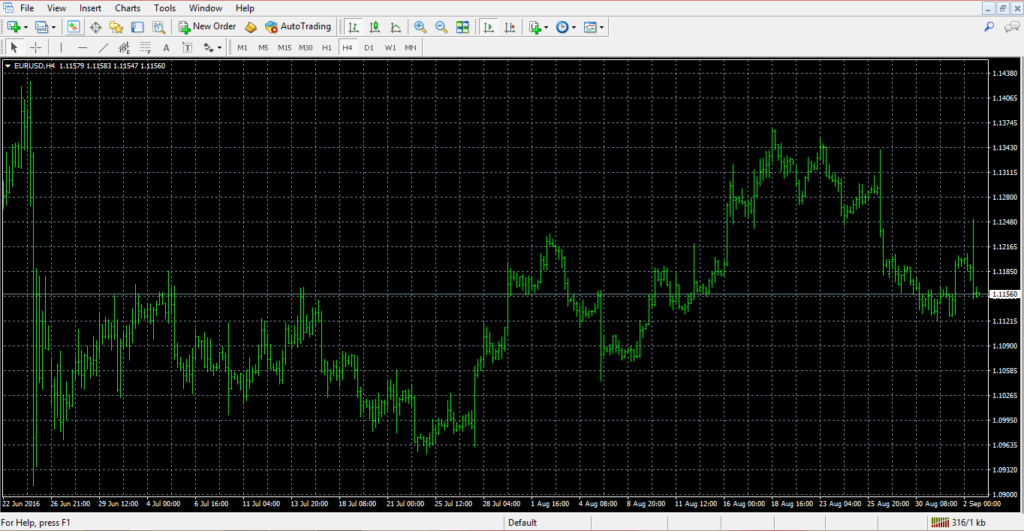
以默认设置打开时,MetaTrader 提供的图表见下图。它并非对任何交易目的都有用,更不必说进行外汇交易时自行绘制图表。
对于这样一张图表,有许多事要做。首先,选择想要的图表类型:蜡烛图、柱状图或折线图。
强烈建议使用蜡烛图,因为日本蜡烛图技术可以应用到实际价格之上。在 MetaTrader 平台上半部分(中间位置)可以看到三种图表类型选项。选中蜡烛图后,我们要知道如何区分这些蜡烛,也就是看价格上行和下行走势。建议采取如下步骤:
- 右键单击图表,选择“属性”。先打开“颜色”选项卡,现在我们可以选择图上所有基本内容的显示颜色。背景色默认为黑色,先不更改此项。请注意,背景色也可改为其他任何颜色。前景为屏幕右侧显示的价格水平,图表下方沿水平方向为时间元素。前景色必须与背景色不同,否则将看不到信息。我们坚持前景色选用白色。


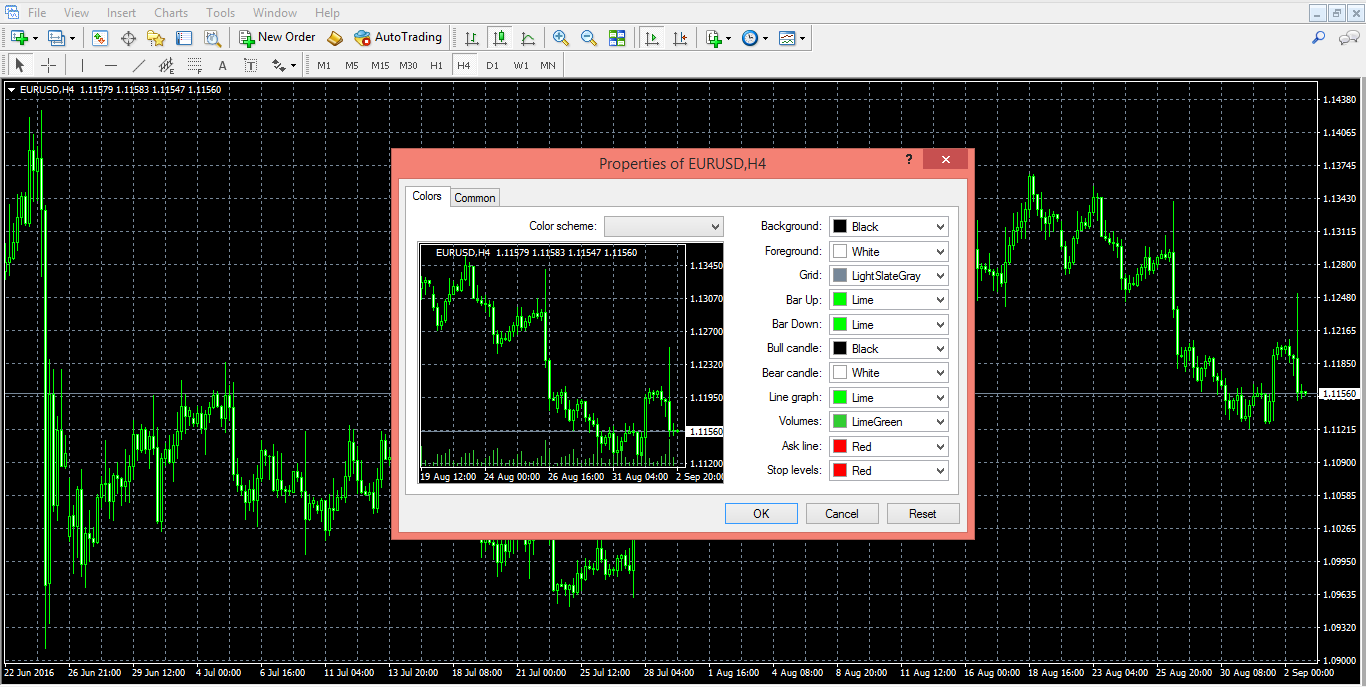
- 网格由分割屏幕的小方格组成,然后可以根据需要选择隐藏网格。这时,如果想使用该功能,可更改其颜色。
- 可使用“上涨柱”、“下跌柱”、“上涨蜡烛”和“下跌蜡烛”选项给蜡烛上色。下跌蜡烛一般采用红色,而上涨蜡烛始终以绿色表示。
- 设置图表时,其他线条不太重要。然后,我们在“属性”选项卡左上角切换至通用选项卡。您可以在这里看到“图表自动滚动”选项为默认值,但我们不想要一个总是将您拖到最新价格的图表。技术分析意味着要看过往记录,这可以通过选择“图表移动”选项取消“图表自动滚动”来实现。
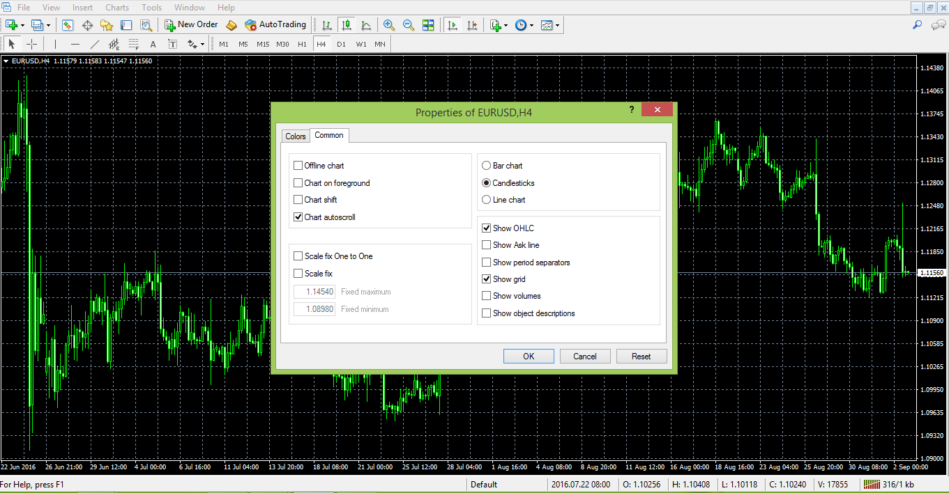
- 选择不显示网格后,图表是这个样子。
保存模板
下一步,实现此流程自动化,这样我们每打开一个新图表时就不必重复操作。它可以通过将图表保存为模板来实现。右键单击图表,选择“模板”选项卡。点击“保存模板”并命名即可。
之后,每次打开任意货币对的新图表或不同时间打开同一货币对图表时,就能加载该模板。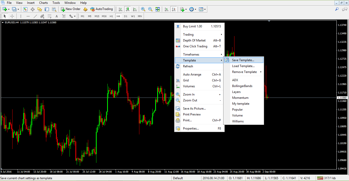
保存配置文件
保存模板之后,即可开始技术分析。视乎所用技术分析类型而定,我们可以在图表上做不同事情。艾略特波浪用户利用该理论来有效计算波浪数,让交易图上呈现出许多数字和字母。这些交易者希望解读出市场处于推进波动还是调整。艾略特理论称,价格走势由五浪及另外三个调整浪组成。数字用来计算推进浪或五浪,字母用来计算调整浪。也有些交易者利用趋势指标(用于图上可见的实际蜡烛)或震荡指标(始终应用于图表底部,而非实际蜡烛)来找出进入或退出市场的点位。交易者还能运用市场几何学。这涉及从往期价格开始的许多线条和通道,对图表右侧作出预测,进而找出支持位和阻力位。这很重要,也能应用于交易当中。
不论采用哪种交易风格和技术分析方式分析图表,都可以随时将其保存为“配置文件”。关闭 MetaTrader 平台则自动保存此操作和配置文件,重新打开时所有之前的操作仍在。可从其他 MetaTrader 账户非常轻松地提取和加载配置文件是该交易平台的魅力之一。以上仅列述了如何在 MetaTrader 中设置图表和利用图表区域分析市场的基本内容。只有努力研究和自行寻找 MetaTrader 中的提示和诀窍,方能理解为何 MetaTrader 对全球零散交易者而言是最好的交易平台。
Best and most trusted forex brokers in 2024
Other educational materials
- Forex Trading Accounts and the Value of a Pip
- The Importance of Swap and Spreads
- How to Enter/Exit a Trade
- How Do I Make a Profit from Forex Trading?
- Forex Market Terminology
- Profit from Forex Trading Using Different Trading Styles
Recommended further reading
- Testing for arbitrage opportunities within the foreign exchange market. Hussain, I. (2009).
- “INNOVATE ONLINE TRADING BY ADDING SOFTWARE BRIDGE: IDEA AND IMPLEMENTATION.” (2014). Qureshi, Muhammad.