Video Transcription: How to Set up a Chart in Metatrader
Hello there, this is Topratedforexbrokers.com here, and we continue our trading academy with a new concept regarding the charts and the MetaTrader. You know what the MetaTrader is? It’s the most popular trading platform when it comes to retail trading. And today we will discuss the particulars of a chart of a currency pair.
(0.25) First of all, you must pick a currency from this MarketWatch here. And it doesn’t matter what that currency is, as the steps that we will discuss here will be valid for both the Metatrader 4 and Metatrader 5.
(0.43) So, for example, let’s choose USD / Japanese Yen. We can either click and drag a currency pair on an actual chart that is already in front of us, like this, and then you will have the USD/Japanese Yen on the screen, or, right-click, and we go for chart window and a new chart window here will open with the desired currency.
(1.11) If we want to have more space for analysis, we can close the market watch from here. You can easily open it and close it just by selecting it, and now the chart is showing across the screen. Let’s repeat the steps that we discussed in the previous video. Right click properties and go to the ‘colours’ and go either “bar up” where a bullish move is usually associated with the colour green, but you can actually set up the colours however you like.
(1.49) ”Bar down” or a bearish move is shown in red, so a bull candle should be green, bearish candles should be red. You can choose any kind of background that you want. Let’s choose white and go with a black foreground so that we can see the data and the levels of the currency pair. And then we go onto the current, and you have three options for a chart.
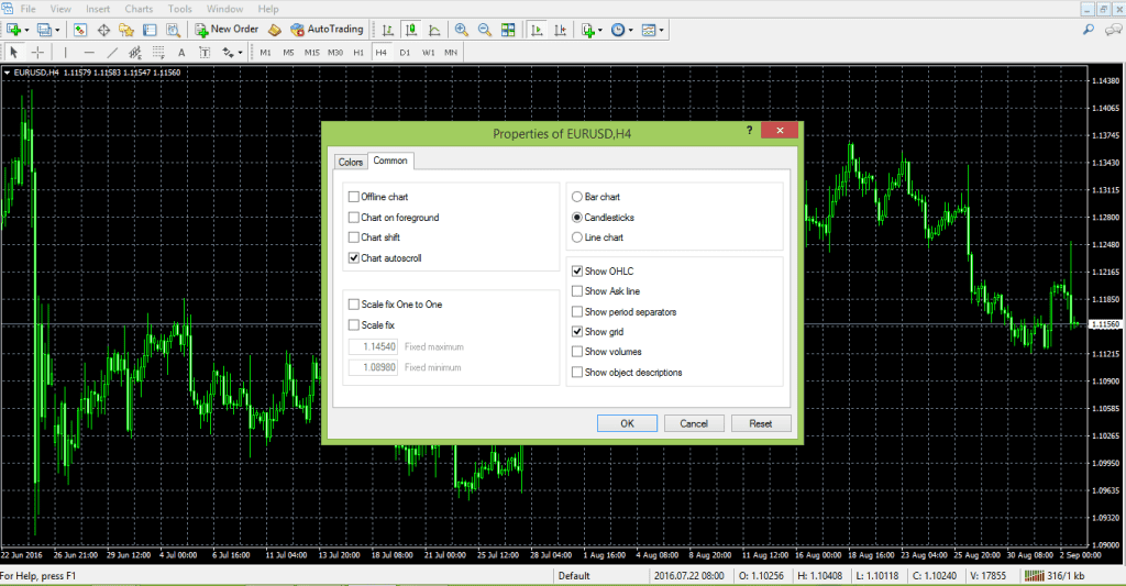
(2.21) By default you will have a bar chart, what does this mean? Let’s zoom in. These are not candles; these are bars. This is an old classic technical analysis as it appeared for the first time in the western part of the world. Technical analysis was invented when people looked for pairs to interpret future price movements over security which was typical of the stock market back then.
(2.50) They used bar charts, and you have the option to use the bar charts here. Or they used line charts and looked at the lines. This is a line that simply coincides with the closing price during the trading day, and it depends very much on the timeframe. This is the hourly chart.
(3.11) So for every hour, you have the closing price, 1 hour, 1 hour, 1 hour and so on, so this is a line chart. Unfortunately, the line chart does not give you the shadows of a candle, and it doesn’t give you the highest point in a candle or the lowest point in a candle.
(3.33) You only end up with the closing price. In the Forex market, this may be tricky, In the sense that, if you put a stop loss here, let’s just say that the market came and spiked at 112.50 coming back and closing the candle and you won’t see that move here in a line chart. But on a candlestick chart, you can see that move, and it is more realistic.
(3.58) So bar charts were the first approach to technical analysis, and a bar chart is very simple to explain. Namely from where the previous bar ends, here, the next one opens, and then you have the highest point, then the lowest point and then the close.
(4.19) And then it starts with the opening, the highest or at the lowest point, the close. The chart connects the previous closing price with the actual opening price of the candle. But the Japanese approach became famous in the Western World, and Westerners embraced the Japanese candlesticks as they are very powerful.
(4.44) We have plenty of examples of Japanese candles here on our trading academy, especially reversal patterns which form and they are quite easy to spot.
(5.01) Anyways, between the three options that we have here; a candlestick chart, a bar or a line chart on the MetaTrader, candlestick charts are the most popular or most used charts among retail traders, so we will use the candlestick charts.
(5.19) Let’s go back to properties, and then on to the colours, let’s say we go back and choose white for the background and black for the foreground. Bar up, green and bar down, red, bull candle we choose green, bear candle, choose red, so we have all the colours set up again.
(5.44) And on the common we have the chart shift. We want the chart to shift so that we have room here for analysis, and we can just have candlesticks and no OHLC as we explained in the previous analysis. No grid and if we click ok the chart will appear in front of us.
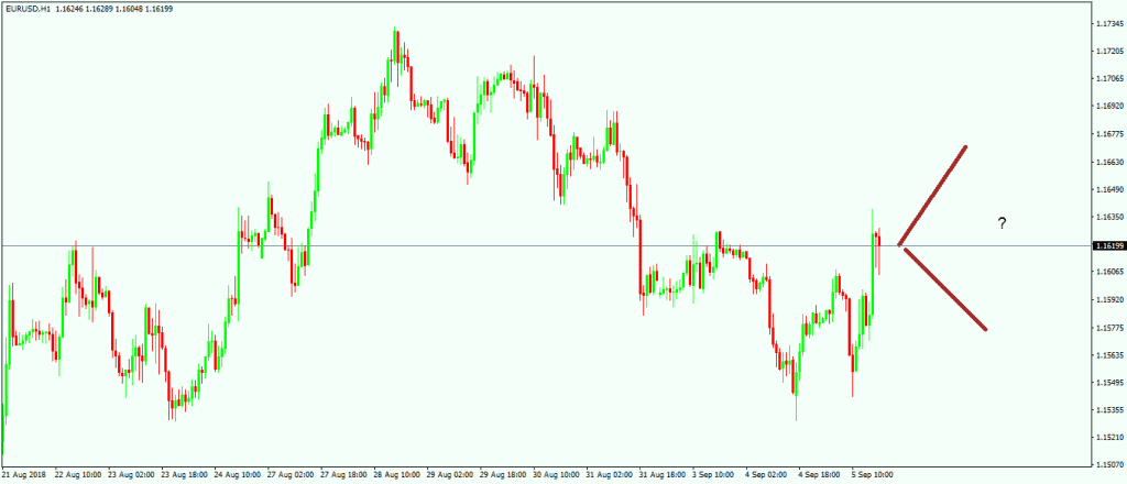
(6.04) If we take a look here, we have a small arrow here on top of the screen (points to arrow), now this small arrow, if you click on it, and drag, then a vertical line appears. Using it, we can shift the chart back to halfway across the screen. This will create all this room here for analysis. What kind of analysis?
(6.27) Drawing a trend line for example, further in time, And then maybe if we have a trend line of a triangle, then maybe the market broke the trend line, comes story tests, and it gives you future support and so on. I am just giving you ideas on how to use the space on the right-hand side.
(6.50) Let us assume that we have set up such a chart for the US Dollar/ Japanese Yen, and then we want to interpret this kind of bullish flag for the pair, keep in mind that everything we do on the MetaTrader, any setup that you make on the MetaTrader won’t save automatically. It will ONLY save when you close the trading platform. So you must close the trading platform.
(7.20) Open it again, and your work is saved. Right now, let’s say something happened like the power goes off. Or the trading platform gets blocked, or there is a problem with the internet etc. then your work won’t be saved. You have got to be very careful to save it, so you should close the platform from time to time. Especially when you set the parameters for your charts.
(7.53) Here you have the hourly chart for the USD/Japanese yen, but as you see, we can easily it is to switch to the four-hour chart or switch to the daily chart, the daily prospective. And so on. But we do not want to repeat the process that we described here.
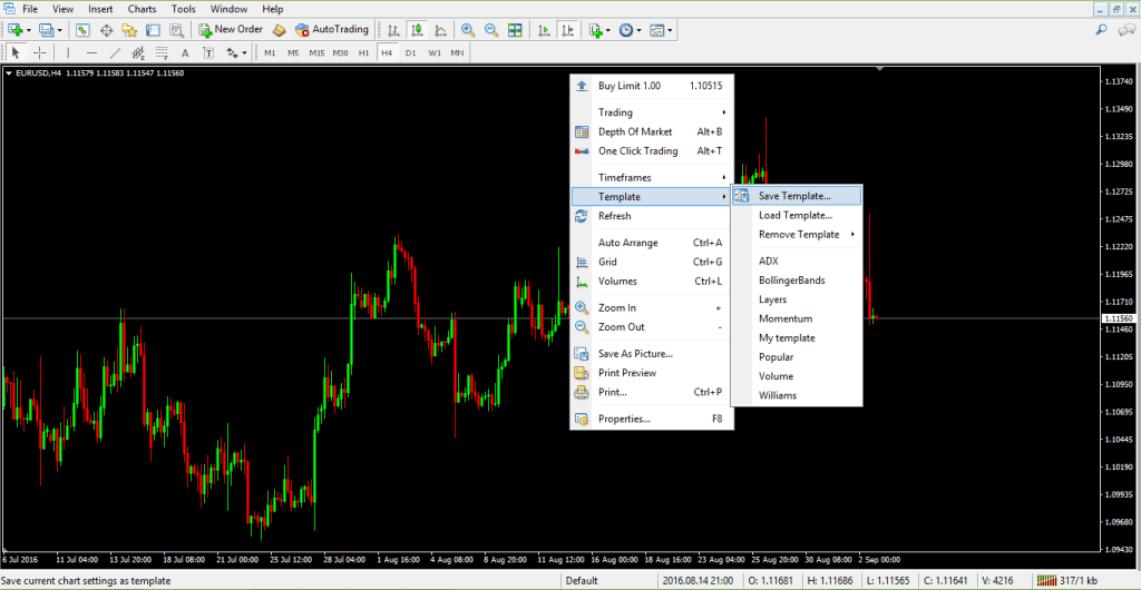
(8.13) We don’t want to repeat these steps every time. If we open a new chart, “File” “New Chart” and choose USD/Swiss Franc, we do not want to go back to properties, and so on, we can easily save the work that we have done, as a template, and then we use this template for any currency pair.
(8.36) Timeframe we want in the future. Right-click, template, save “template”. So we go with this template. Topratedforexbrokers and then we save. And we open a new chart or the one that we have open, for example, the USD/ Swiss Franc and then we right-click, template, and then we simply choose the template here which is topratedforexbrokers and then the chart appears in front of us.
(9.16) There is another trick, whenever the chart opens somewhere, and you want to jump quickly to the end of it, you simply hit the END key on your keyboard, and it will take you to the end. Or if you want to go to the left side of your screen, to back-test a strategy, you simply click on the home button
(9.41) Then it shows values, in this case from 2007 in the hourly chart and you can analyze what the US Dollar/Swiss franc did and so on. The moment that you close the trading platform on the MetaTrader. Your work is saved.
(9.59) This is how you setup a chart on the MetaTrader and the next video will continue with the types of orders that we can place on the MetaTrader.
El análisis técnico trata de interpretar los datos y patrones de precios históricos, con el fin de predecir futuros patrones de precios, acertando los movimientos que se darán en un gráfico. Hay teorías de trading que requieren un análisis profundo de los precios históricos antes de que un trader pueda definir un marco temporal que sea útil para realizar operaciones. Un ejemplo de este tipo de teorías es la Teoría de las Ondas de Elliott. Saber cómo se configura un gráfico en MetaTrader ayudará a automatizar los marcos temporales. Otros traders usan diferentes indicadores técnicos, como los indicadores de tendencias o los osciladores al entrar o salir de una operación. Para hacer esto en MetaTraders es necesario conocer algunas cosas básicas.
Ajuste de la plataforma
Al abrir una tabla con la configuración predeterminada de MetaTrader, aparece la imagen de abajo. No es realmente útil a efectos de la realización de operaciones y mucho menos para usarlo como un mapa que guíe nuestra actividad de trading de Forex.
Con un gráfico así se pueden hacer diferentes cosas. Para empezar, hay que decidir qué tipo de gráfico queremos usar: velas japonesas, barras o líneas.
Recomendamos encarecidamente el uso de un gráfico de velas japonesas, debido a que se pueden aplicar técnicas específicas de velas japonesas, además de visualizar los precios reales. Las tres opciones para elegir un estilo de gráfico están disponibles en la mitad superior de la plataforma MetaTrader, justo en el medio. Después de seleccionar un gráfico de velas, necesitaremos saber cómo diferenciarlas entre sí. Esto significa, saber cuándo el precio se ha movido al alza o a la baja. Se recomienda seguir los siguientes pasos:

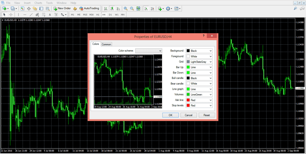
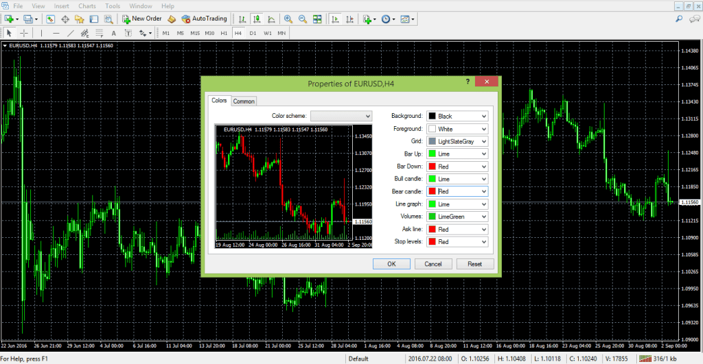
- Haga clic derecho sobre el gráfico y elija Propiedades. Primero se abrirá la pestaña Colores. Aquí podremos escoger los colores que deseamos aplicar a los elementos básicos que aparecen en el gráfico. El color predeterminado para el fondo es negro y lo dejaremos así por ahora. Sin embargo, es bueno recordar que se puede cambiar por cualquier otro color. En un primer plano se muestran los niveles de los precios, que están en la parte derecha de la pantalla, mientras que el eje temporal se muestra horizontalmente, en la parte inferior de nuestro gráfico. El color de este primer plano debe ser diferente al color utilizado para el fondo. De otra manera, la información no se verá. En este caso, vamos a elegir el blanco.
- La cuadrícula está formada por las pequeñas cajas en las que la pantalla se divide. Posteriormente tendremos la opción de deshacernos de ellas si queremos. Podemos cambiar el color de la cuadrícula, en caso de que deseemos usar esta opción.
- Entre las opciones que tenemos a nuestra disposición para colorear las velas, tenemos Barra arriba, Barra abajo, Vela alcista y Vela bajista. El color convencional para una vela bajista es el rojo, mientras que el verde siempre muestra una vela que se está moviendo al alza.
- El resto de las líneas no son tan importantes a la hora de configurar un gráfico. Ahora es el momento de pasar a la pestaña General dentro de las Propiedades de nuestro gráfico. Como se puede ver aquí, la opción de desplazamiento automático es la opción predeterminada, pero no queremos trabajar con un gráfico que siempre nos arrastra a los precios actuales. El análisis técnico supone mirar hacia atrás en el tiempo y para hacerlo, podemos elegir la opción Mover gráfico, deshaciéndonos de la opción predeterminada de desplazamiento automático.
- Si elegimos no mostrar la cuadrícula, el gráfico se ve así.
Guardar una plantilla
Lo siguiente que vamos a aprender es cómo automatizar este proceso, para no tener que repetirlo cada vez que abrimos un nuevo gráfico. La manera de hacerlo es guardar el gráfico como una plantilla. Para ello debemos hacer clic derecho sobre el gráfico y seleccionar la pestaña Plantillas. A partir de ahí, guardamos la plantilla, le añadimos un nombre y listo.
A partir de este momento, cada vez que abramos un nuevo gráfico en cualquier par de divisas, o en el mismo par de divisas pero con un marco de tiempo diferente, podremos usar esta plantilla con solo cargarla.
Guardar un perfil
Después de guardar nuestra plantilla podemos empezar con el análisis técnico. Dependiendo de qué tipo de análisis técnico queramos aplicar, se pueden hacer diferentes cosas en un gráfico. Los usuarios de las Ondas de Elliott aplican esta teoría para contar las ondas de una forma efectiva, por lo que un gráfico de trading suele tener un montón de números y letras. La intención de estos traders es interpretar si el mercado está llevando a cabo un movimiento impulsivo o correctivo, ya que según la teoría de Elliott, los movimientos de los precios consisten en cinco ondas, corregidas por otras tres. Los números sirven para contar las cinco ondas impulsivas, mientras que letras se utilizan para contar las ondas correctivas. Otros traders determinan los mejores lugares para entrar o salir de un mercado usando los indicadores de tendencias (que se aplican sobre las velas que se pueden ver en el gráfico), o los osciladores (que siempre se aplican en la parte inferior del gráfico y no sobre las velas). También se puede usar la geometría de mercado, que implica añadir un montón de líneas y canales, que comienzan a partir de los precios más antiguos y que se proyectan hacia la parte derecha del gráfico, mostrando los niveles de soporte y resistencia, que son importantes y útiles para realizar operaciones.
No importa qué el estilo de trading o qué tipo de análisis técnico se esté aplicando en un gráfico, siempre es posible guardar el estado actual del gráfico, como un Perfil. Al cerrar la plataforma MetaTrader, el perfil en uso y todo el trabajo realizado se guardan automáticamente. Al volver a abrirla, todos nuestros datos estarán ahí. Una de las características más prácticas de esta plataforma es que se puede exportar cualquier perfil para después cargarlo en otra cuenta de MetaTrader con mucha facilidad. Lo que hemos mencionado en este es la información más básica sobre cómo configurar un gráfico en MetaTrader y cómo usarlo para analizar el mercado. Solo a través del trabajo duro y de su propia experiencia descubriendo los trucos de uso de MetaTrader podrá descubrir los motivos que la convierten en la mejor plataforma de trading del mundo, para los traders comerciales.
Ranking de los mejores brókers de forex online

Welcome Bonus
100%
Min Deposit: $100
Fully automated MT4 trader, limited to 9 currency pairs.
Starting price: $199
Verified trading by Mislav Nikolic & Chris Svorcik.
Starting price: €199

FXTM’s Dow Jones news advisor comes with in-built calendar events.
Starting price: $10
Cryptocurrency Trading
40+ currency pairs
Min Deposit: $100
Other educational materials
- Forex Trading Accounts and the Value of a Pip
- The Importance of Swap and Spreads
- How to Enter/Exit a Trade
- How Do I Make a Profit from Forex Trading?
- Forex Market Terminology
- Profit from Forex Trading Using Different Trading Styles
Recommended further reading
- Testing for arbitrage opportunities within the foreign exchange market. Hussain, I. (2009).
- “INNOVATE ONLINE TRADING BY ADDING SOFTWARE BRIDGE: IDEA AND IMPLEMENTATION.” (2014). Qureshi, Muhammad.